A case for house plants: color, form, texture, care, contrast, texture, (≠) man-made, and progress.


A case for house plants: color, form, texture, care, contrast, texture, (≠) man-made, and progress.
Valentino Fall/Winter 2014-2015: color, geometry, retro, defined flow, and restraint. Note the contrasting use of print and solids from that of Burberry.
Dior, Autumn/Winter 2014: luxe, detail, architectural, structured, and intricate–note the shades of cream and white. Could have done without the soundtrack.
Spring 2015 is the subject of many a runway at the moment. For those of us who are behind (or wildly present), a bit of that which is “it” for Fall 2014 may be of aid.
Burberry Fall/Winter 2014-2015: rich, deep, sheer, belted, flowing, and layered–much to enjoy.
Photographs are an essential joy in my life. Capturing a moment of a loved one or a favorite environment is a deep interest.
Dating an incredible man has the effect of permitting new perspectives. My man loves visual order and functionality in ways I, perhaps, don’t require (the reverse is also true). By the 5th (200th) time the magnets were dislodged and the pictures tumbled, I began to understand. The new perspective? Much improved. [Additional tape must be procured.]


Old and intricate, this piece will eventually grace a neutral setting, where it won’t have to compete for attention. In the meantime, enjoying the satisfaction of an affordable, interesting piece with storage. There are a few imperfections that may be mended; a treasure scooped up with a patient boyfriend, antiquing.


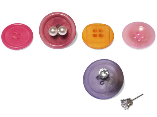
Found this suggestion on Elle Decor’s 44 Household Items You’re Using Wrong, courtesy of Good Housekeeping. Keeping the studs together with their necessary backs–just need some wide set buttons.
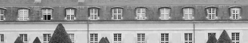
An exacting mix of design, resources ($), scenery, ruggedness, refinement, and minimalism–incredible.


Photographs courtesy of ccca.co.nz
